Showing posts with label infographics. Show all posts

Saturday, March 21, 2015

Funny pop music diagrams

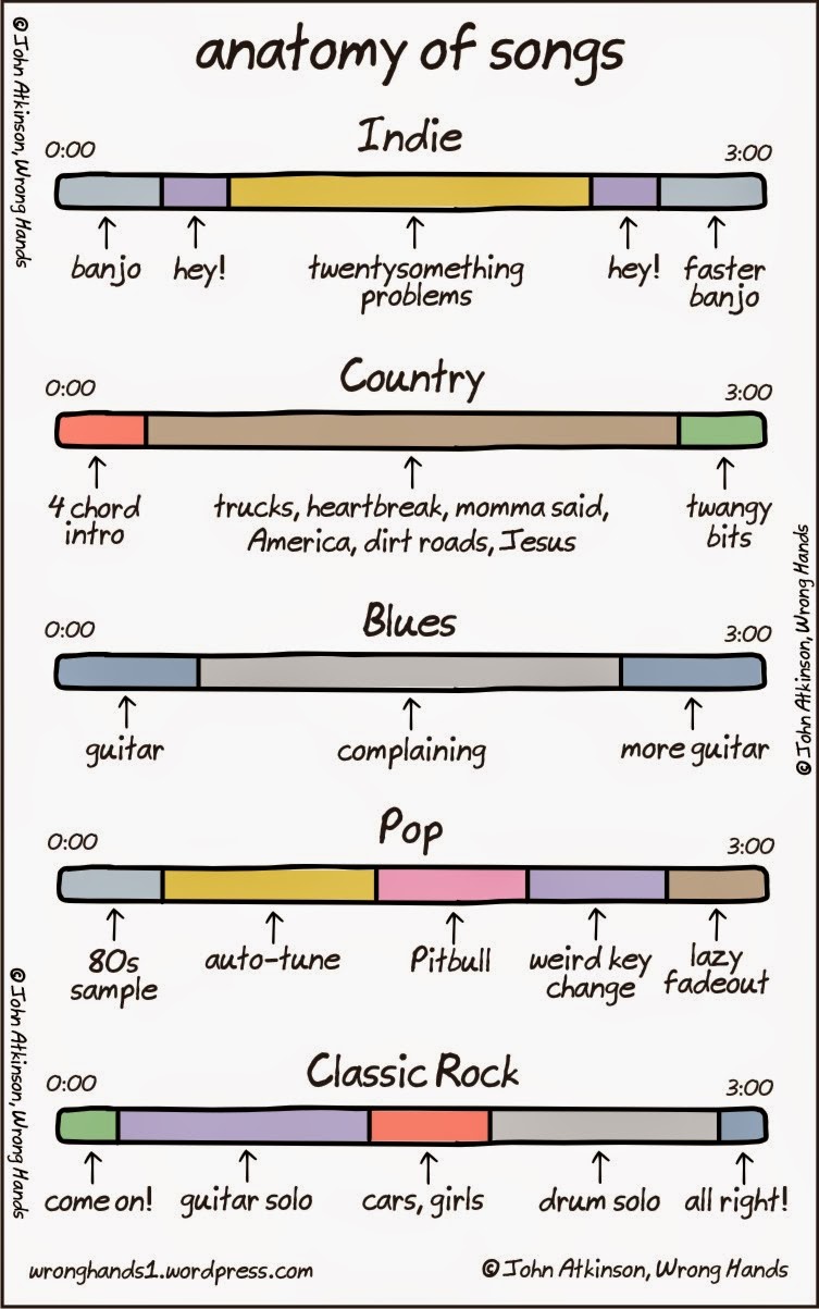
I love humorous graphics that diagram pop music songs.
Up top is a favorite of mine from cartoonist John Atkinson called “Anatomy of songs,” which he posted on his Wrong Hands blog in July 2014.
The pop music portion appears to have been inspired by an Internet meme that first cropped up online about three years ago on Reddit and elsewhere. It showed a modern pop song interspersed with rapper Pitbull saying weird things.

Pitbull is an easy target and has been parodied quite often online.

Atkinson followed up his original cartoon in January with “Anatomy of more songs.”

Recently I discovered a blog called Song Lyrics in Chart Form from comedian Erik Tanouye.
Instead of poking fun at genres, he diagrams the lyrical content of individual pop songs.
I’ve posted a few examples below.


Thursday, March 31, 2011

Why streaming video beats DVDs

The other day my daughter wanted to watch a Disney movie on DVD. So I popped the disc into the DVD player, waited for it to boot up, then navigated through screen after screen of commercials, previews and FBI warnings before getting to the main menu.
It was a frustrating experience. And one I’ve been through hundreds of times before.
All I wanted to do was hit play and for the movie to start. But Hollywood studios see home video as another opportunity to sell stuff.
That’s why the experience of streaming online video, such as Netflix, is so much better. You find the movie you want, press play and the movie starts. It’s that simple.
The stark comparison reminded me of an infographic I saw a while back about why people prefer pirated movies to authorized movies on DVD. (See article on BoingBoing.) With the pirated version, you get to skip all the filler before the movie starts.
So I took that graphic and edited it to compare streaming vs. DVDs. (Click on the image above for a larger view.)
Enjoy.
Tuesday, May 18, 2010

Cool infographics on video games, Google, mobile phones and the 2010 U.S. Census

Following yesterday’s post about the infographics boom online, here are several more interesting mega-charts – this time about technology.

Video Game Timeline (Online Education)

Teens and Their Mobile Phones (Flowtown)

Google Facts and Figures (Pingdom)

Government requests directed at Google and YouTube to remove content or provide information about users (Google)

2010 Census Participation Rates (United States Census 2010)

Art: Screenshot of current participation in 2010 U.S. Census

Monday, May 17, 2010

Sex, drugs and rock ’n’ roll infographics

Infographics are big – literally and figuratively – on the Web these days.
Digital artists have embraced the idea of designing large graphics that contain tons of information in charts and tables. These are pretty graphics that you need to scroll down and sometimes sideways to read.
A great place to find fun infographics is OnlineSchools.org. You can see several examples of their work below.
In keeping with the headline of this article, here is a set of infographics about sex, drugs and rock ’n’ roll:

Porn vs. the Economy (Visual.ly)

The Striptease (Infographicality)

Coming Clean about Infidelity (Infographic List)

The Scoop on Semen (CafeMom)

Illegal Drugs in the Americas (Next Generation Pharmaceutical)

The Music Industry and Online Piracy by the Numbers (Deviant Art)

The iPod Revolution (Mashable)

Art: Online Schools logo